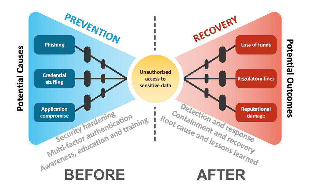
Bow tie risk diagrams are used in safety critical environments, like aviation, chemicals and oil and gas. They visualise potential causes and consequences of hazardous events and allow for preventative and recovery controls to be highlighted.
You don’t have to be a gas engineer or work for a rail operator to benefit from this tool, however. Cyber security professionals can use simplified bow tie diagrams to communicate security risks to non-technical audiences as they succinctly capture business consequences and their precursors on a single slide.
If you work for one of the safety critical industries already, using this technique to represent cyber risks has an added benefit of aligning to the risk assessment patterns your engineers likely already use, increasing the adoption and harmonising the terminology.
There are templates available online and, depending on the purpose of the exercise, they can vary in complexity. However, if you are new to the technique and want to focus on improving your business communication when talking about cyber risk, I suggest starting with a simple PowerPoint slide.
Feel free to refer to my example diagram above where I walk through a sensitive data exposure scenario. For example, it can occur through either a phishing attempt or a credential stuffing attack (supply chain and web application/infrastructure exposure being another vector) leading to a variety of business consequences ranging from a loss of funds to reputational damage. The figure also incorporates potential preventative barriers and recovery controls that are applicable before and after the incident respectively.
Thanks for sharing, an interesting perspective I haven’t come across before!